
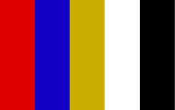
Obangsaek, the five cardinal colors — image by Regis Flanagan, CC BY-SA 4.0, via Wikimedia Commons
Korea's Colors Are the Five Elements Made Visible
When you look at a child's rainbow-striped hanbok sleeve, the painted eaves of a Korean palace, or the neat rings of color on a bowl of bibimbap, you are not just looking at pretty decoration. You are looking at a philosophy.
Korea's traditional palette is built on five orthodox colors known as obangsaek (오방색, 五方色) — literally "the colors of the five directions." Each color is tied directly to one of the Five Elements (오행) of East Asian natural philosophy, along with a compass direction and a season. The palette isn't a matter of taste. It's a map of how the old worldview organized the cosmos: color, element, direction, and time as one connected system.
Once you know the code, you start seeing it everywhere in Korea — in clothing, architecture, ritual, and especially on the plate.
The Five Colors of Obangsaek
The five cardinal colors each correspond to an element, a direction, and a season. This is the core table worth memorizing.
| Color | Hanja | Element | Direction | Season | Meaning |
|---|---|---|---|---|---|
| Blue / green (cheong) | 靑 | Wood | East | Spring | Growth, vitality, new life |
| Red (jeok) | 赤 | Fire | South | Summer | Passion, energy, warding off evil |
| Yellow (hwang) | 黃 | Earth | Center | — | The center; the most honored color, tied to the sovereign |
| White (baek) | 白 | Metal | West | Autumn | Purity, honesty, truth |
| Black (heuk) | 黑 | Water | North | Winter | Wisdom, depth, stillness |
A few things stand out. Yellow sits at the center rather than at a compass point, and it was historically the most honored of the five — the color associated with the sovereign. Blue (cheong) in this system covers a range Westerners might split into blue and green; the classical category is broader than the modern English word.
Between the five cardinal colors lie the secondary or intermediate colors, called obangansaek (오간색) — the "in-between" shades that fill out the full spectrum. So the system isn't just five flat tones; it's a complete color logic with primaries and blends.
Where You Actually See Obangsaek
Saekdong hanbok: the rainbow sleeve
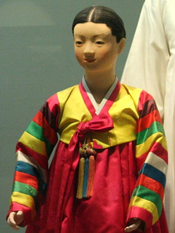
Saekdong, the five-color striped sleeves — photo by Brian Negin, CC BY-SA 3.0, via Wikimedia Commons
The most instantly recognizable use of obangsaek is saekdong (색동) — the multicolored striped fabric used on the sleeves of hanbok. You've almost certainly seen it on a Korean child at a celebration.
Saekdong was historically associated with children and festive occasions. Its most iconic appearance is at the dol (돌), the first-birthday celebration, where a baby wears a saekdong jacket. The bright bands of color weren't only cheerful — they carried the protective idea of warding off misfortune and inviting good fortune onto a young life. The same festive, protective logic put saekdong on celebration clothing more broadly.
Dancheong: the painted temples and palaces
Look up at the eaves and beams of a Korean Buddhist temple or a royal palace and you'll see dancheong (단청) — intricate decorative painting in the five obangsaek colors. Dancheong served practical and symbolic ends at once: it protected the wood from weather and insects, marked the importance of the building, and wrapped the structure in the harmony and protection the five colors were believed to carry. It's obangsaek at architectural scale, and it's one of the defining visual signatures of Korean heritage sites.
Bojagi: wrapping cloth as everyday art
Obangsaek also lives in bojagi (보자기), the traditional wrapping cloths used to carry, store, and present objects and gifts. A wrapped gift in balanced colors carried good wishes along with its contents — the packaging itself was meaningful.
Ritual and celebration items
The five colors show up in obanggi (오방기), the five-direction flags used in shamanic and ritual contexts, as well as in fans and various celebration items. In these settings the colors act as a kind of cosmic addressing system, invoking the directions and their elemental energies.
Five-Color Food: Obangsaek You Can Eat
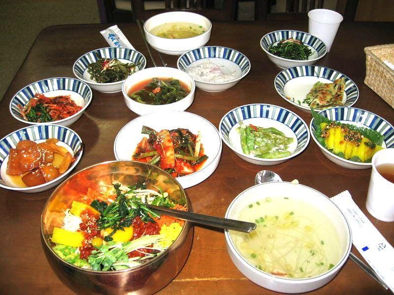
Bibimbap arranged in the five colors — photo by Johannes Barre (iGEL), CC BY-SA 3.0, via Wikimedia Commons
Here's where obangsaek becomes truly delicious. Korean cuisine deliberately balances the five colors on a single dish, because five colors = five elements = balance.
The clearest example is bibimbap (비빔밥): a bowl arranged so that the toppings hit all five color-elements — green vegetables (Wood), red chili paste or red vegetables (Fire), yellow egg yolk (Earth), white rice or egg white (Metal), and dark seasoned greens, mushrooms, or gim/seaweed (Water). The arrangement isn't just for the photo. It's an edible statement of harmony.
Other dishes carry the same idea:
- Gujeolpan (구절판) — a nine-sectioned platter with vegetables, meats, and thin wheat pancakes, arranged as a deliberate rainbow of colors around a central wrapper.
- Japchae (잡채) — glass noodles tossed with vegetables and egg in a spread of colors.
- Sinseollo (신선로) — an elaborate royal-court hot pot layered with ingredients in balanced hues.
- Garnishes (고명) — the finishing touches of egg white and yolk cooked separately, gim, chili threads, and vegetables that color-code countless everyday dishes.
Behind this is the principle of yaksik dongwon (약식동원, 藥食同源) — "food and medicine share the same source." Eating across the five colors was understood as eating across the five elements, and therefore as nourishing the whole body in balance. Long before "eat the rainbow" became a nutrition slogan, Korean cooking already had a five-color version rooted in cosmology.
What the Colors Mean: Harmony, Protection, Balance
The through-line across hanbok, architecture, cloth, and food is the same set of ideas:
- Harmony and balance — assembling all five elements in one place, whether a bowl or a building, expresses a complete, well-ordered cosmos.
- Warding off evil (액막이) — bright, orthodox colors, especially red, were believed to repel misfortune and bad influences. This is much of why children wore them.
- Food as medicine — the yaksik dongwon idea that balanced color means balanced nourishment.
Two colors deserve a special note. White looms large in Korean self-image: Koreans have historically been called the "white-clad people," baegui minjok (백의민족), for their long fondness for undyed white clothing. And red and blue together evoke the yin-yang of the taegeuk — the red-and-blue swirl at the center of the South Korean flag — where the two colors stand for the complementary forces of the universe.
See Them Yourself
Obangsaek is easy to encounter in person if you know where to look:
- Palaces and temples for dancheong — the great Seoul palaces (Gyeongbokgung, Changdeokgung) and mountain temples show off five-color painting on their eaves and gates.
- Hanbok rental — try on a hanbok near a palace and you'll often see saekdong detailing on the sleeves.
- Traditional markets and craft shops — look for bojagi wrapping cloths and saekdong textiles.
- A five-color meal — order bibimbap or gujeolpan and, before you mix it, notice how the plate hits all five colors. That's obangsaek on your table.
The Same Five Elements Color Your Saju
Here's the connecting thread: the very same Five Elements that assign a color to each direction also make up the structure of your Saju (Korean birth chart). Your chart has its own balance of Wood, Fire, Earth, Metal, and Water — and, by extension, its own dominant and missing "colors."
Is your chart heavy in Fire (red) — all passion and heat? Or missing Water (black) — short on depth and stillness? The color logic of obangsaek is the same logic that shapes personality and fortune in Korean fortune-telling.
Find your element balance with the free Saju calculator, and read more about the framework behind it in The Five Elements.
A Note on Interpretation
Obangsaek is a real, well-documented feature of Korean traditional culture, but symbolic color systems are interpretive by nature. Meanings shifted across dynasties, regions, and contexts, and not every use of a color in Korean life is a deliberate obangsaek statement. Treat the associations here as the shared cultural framework — a lens for appreciating why Korea's traditional palette looks the way it does — rather than a rigid rulebook. The pleasure is in noticing the pattern once you know it's there.